Simprints
Refining a life saving fingerprint scanning app.
BACKGROUND
Simprints is a nonprofit technology company with a portable biometric scanner that allows community healthcare workers to digitally link a person’s fingerprints to their medical records—helping people in developing countries get the care they need.
THE PROBLEM
Before I began working at Smart Design, they worked with Simprints to design and develop a mobile app that pairs with the physical fingerprint scanning device. A year later, Simprints had gathered user feedback on the app and asked us to refine the UI/UX based on their in-field learnings. Additionally they wanted to quickly update and modernize the UI by using Google’s Material Design styles as an interim step to a future brand redesign.
THE TEAM
Creative Director
UI/UX Designer (myself)
Designed at Smart Design.
My responsibilities
My responsibilities included creating a new look and feel for the UI using Google’s Material Design styles, researching accessibility standards to ensure the app was up-to-par with best practices, updating the UX to address pain points from in-field research and leading design presentations with the client.
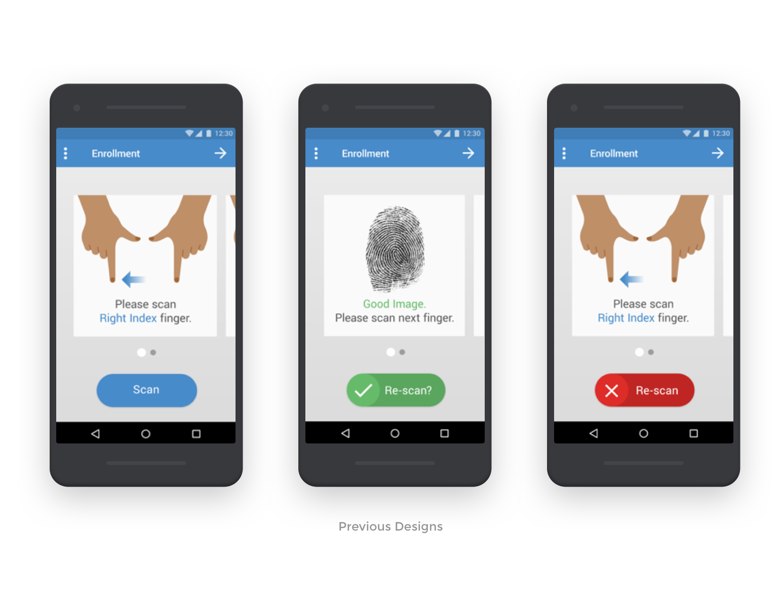

Our goal was to address the major pain points identified during research.
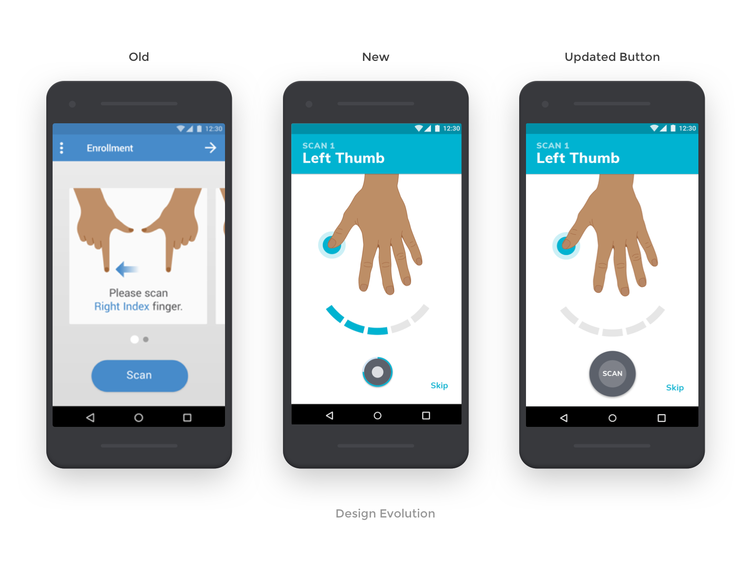
One major pain point was that users had trouble distinguishing between the left and right hand illustrations. This made it difficult for them to quickly assess which finger to scan. We also needed to make a stronger connection between the scan button on the phone and the physical scanner because users did not realize that they could press either button to perform the same action.
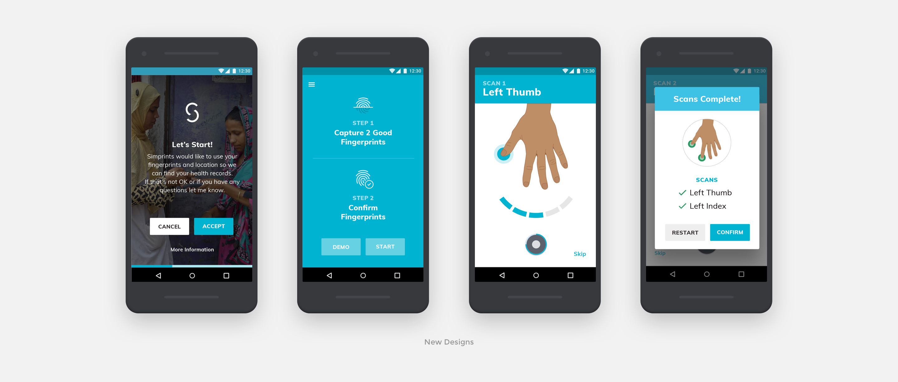

My approach
First, I took a step back and looked at the physical scanner device more closely to see how it could inspire the design of the scan button in the interface. I changed the button UI to be round like the physical device and also mimicked the colored light indicators that animate when the device is scanning. Then, I simplified the hand illustrations to only show one at a time and looked at how we could integrate accessibility features like Talkback to further clarify which hand is shown. Lastly, I explored updates to the primary color palette of the UI based on their brand attributes. I tested these colors outside to check that they would be legible in brighter light, knowing that the app would primarily be used outside.
The results
After the Simprints development team implemented our design updates, the team went back to the field to gather more impressions. We had effectively solved majority of the pain points. The new look and feel was also liked by majority of the participants tested.
While we created a stronger connection between the scan button on the phone and the physical device, users still had difficulty understanding that they could tap the button in the UI because we removed the word ‘scan’. As a follow up we sent them 3 additional design variations of this button to test. The version with 'scan' written inside was preferred by participants.

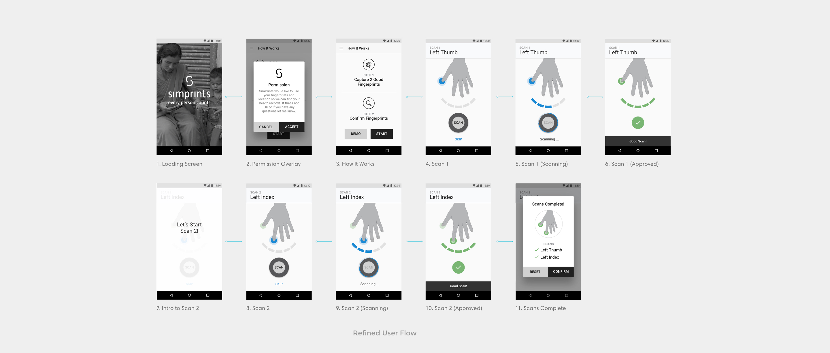

Key Learnings
THINKING GLOBALLY
This app is used in five different countries around the world so it was both challenging and rewarding to see how we could make a flexible design that worked for all cases. It was important to be mindful of skin tone differences when illustrating the hands (we made several shades that populate based on the region) and make sure that the length of text would work in different languages.
NEXT PROJECT
